PLAYING WITH LETTERS
Is better this way
COLOR LOVERS...
THIS IS FOR YOU
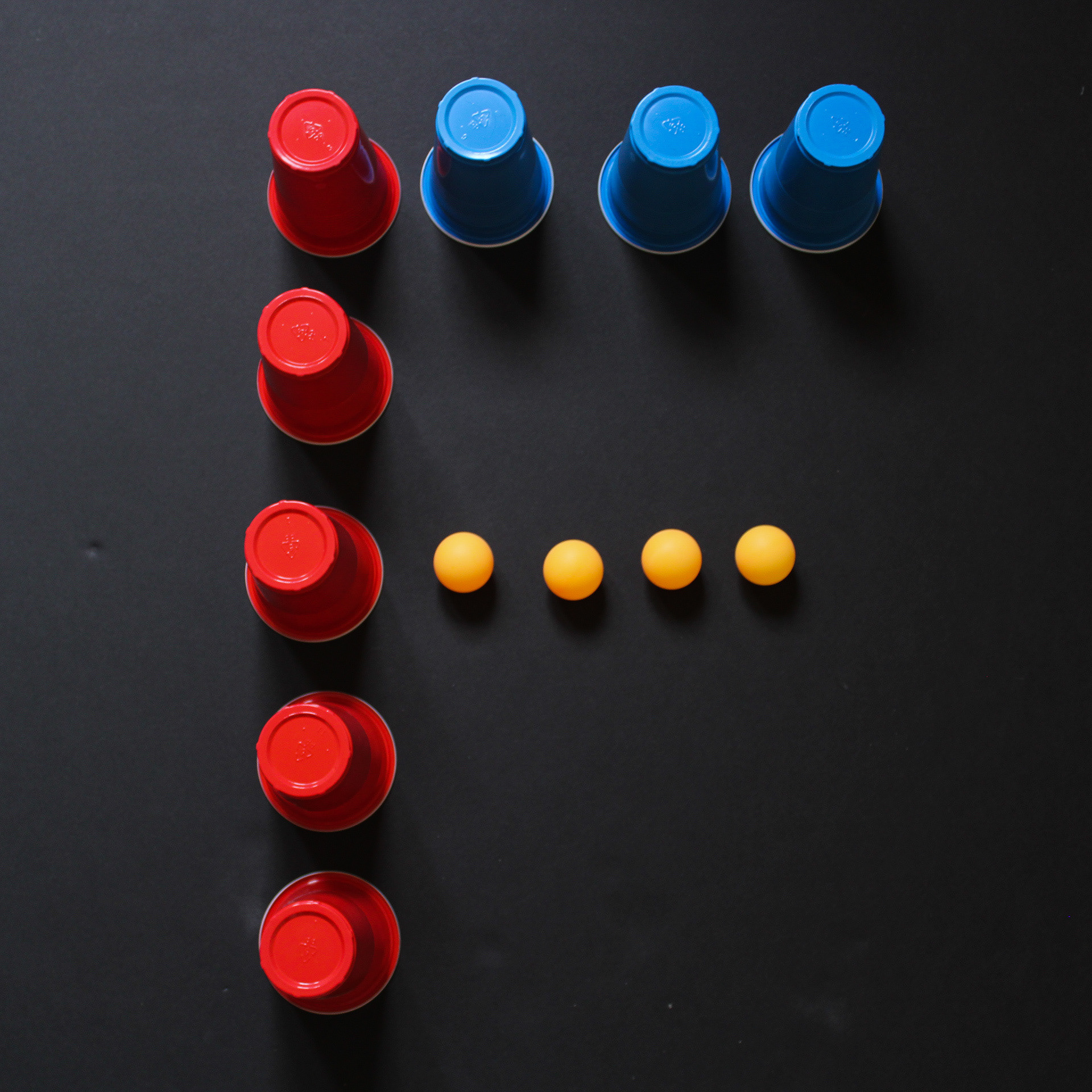
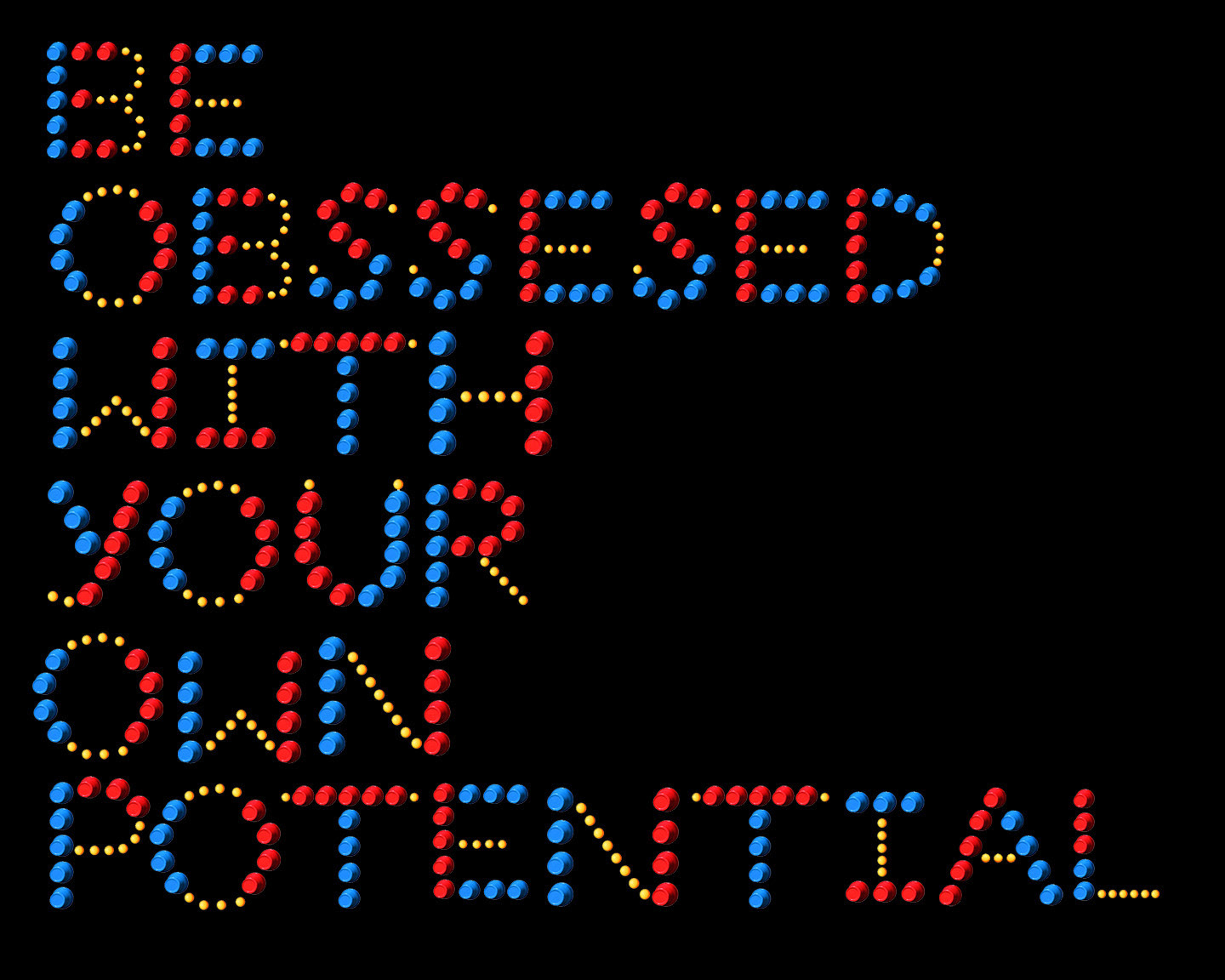
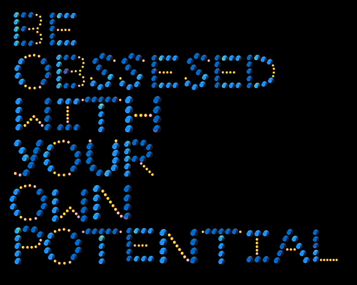
In "Beerpong," my goal was to craft a unique and imaginative physical alphabet. This wasn't just any typography exercise; it was designed to allow the formation of complete sentences using the crafted elements. The intention behind the project was to ensure relatability and adaptability across various creative scenarios. More than just a design challenge, I wanted the process to be playful and enjoyable for creators.


I initiated the project by brainstorming a range of ideas, words, and phrases. This creative process was crucial in guiding me toward the perfect material or shape for my unique alphabet.
From the brainstorm, I narrowed it down to three standout ideas. To get a tangible feel, I experimented with sample photographs using three different materials to evaluate which would best suit the project.

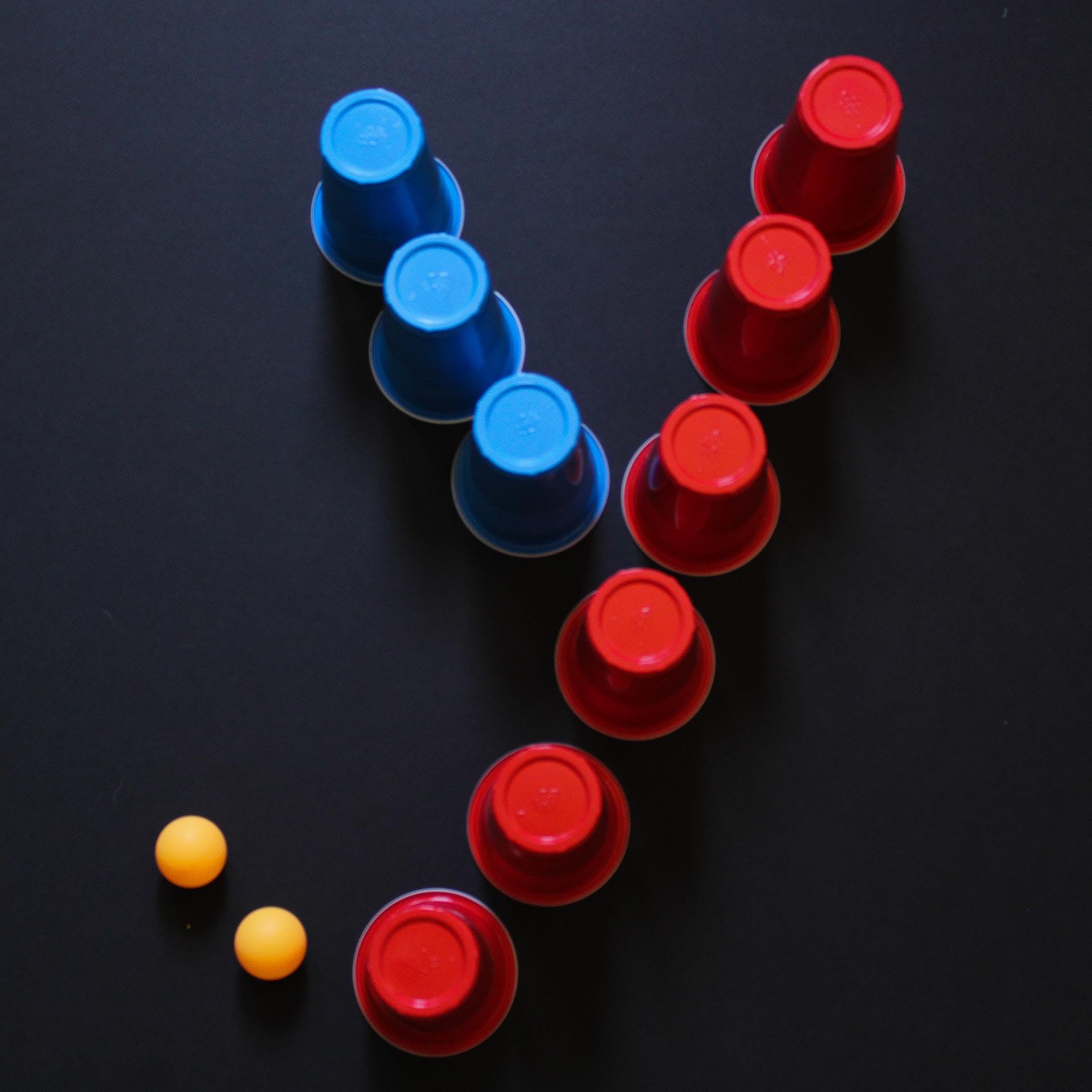
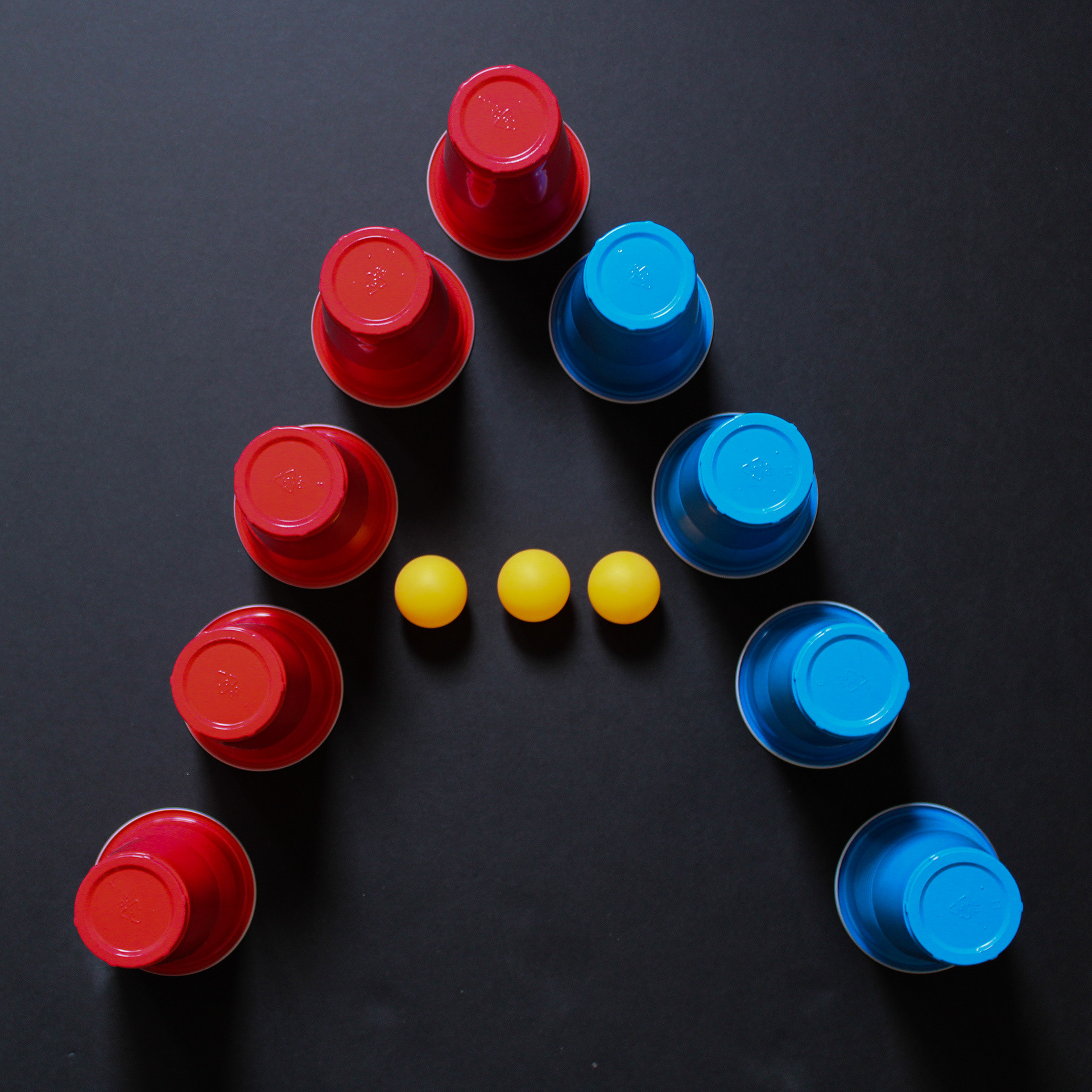
After thorough contemplation, I chose the winning idea that I believed had the most potential and aligned best with my vision. With my concept in hand, I tried on capturing every letter of the alphabet using the selected material, ensuring consistency and clarity in each shot.
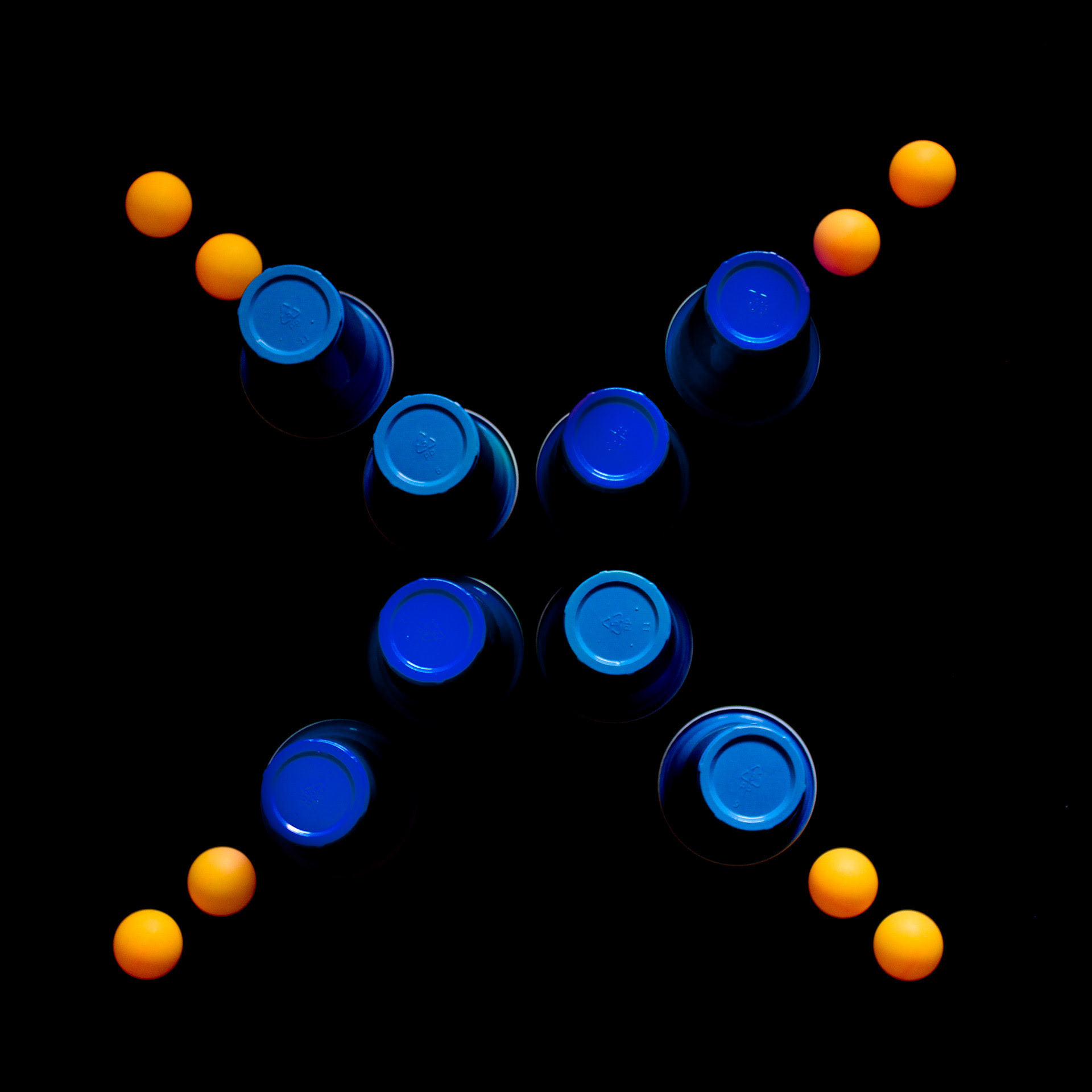
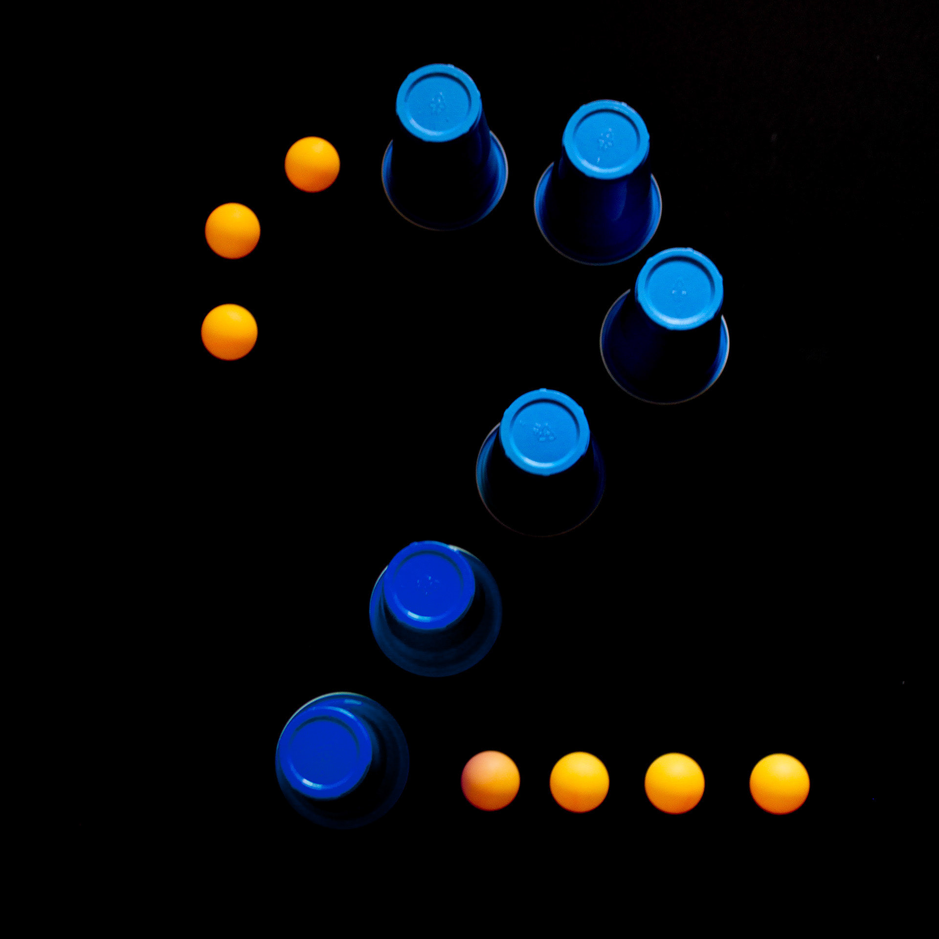
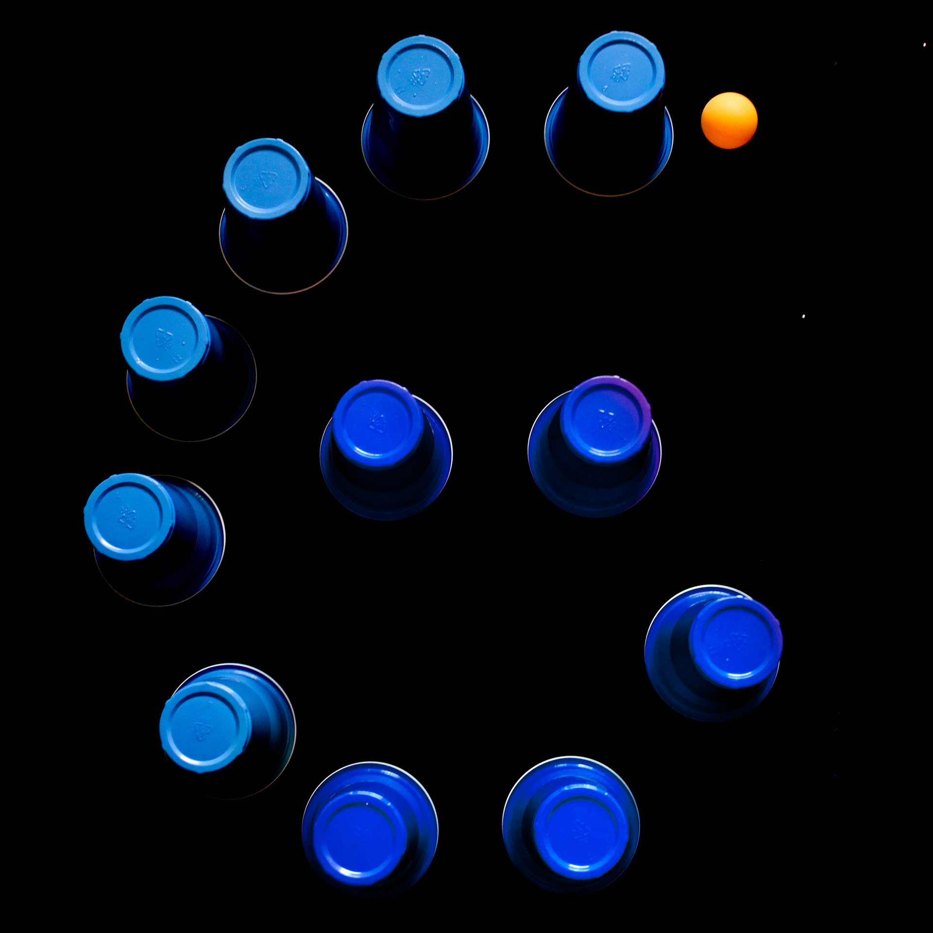
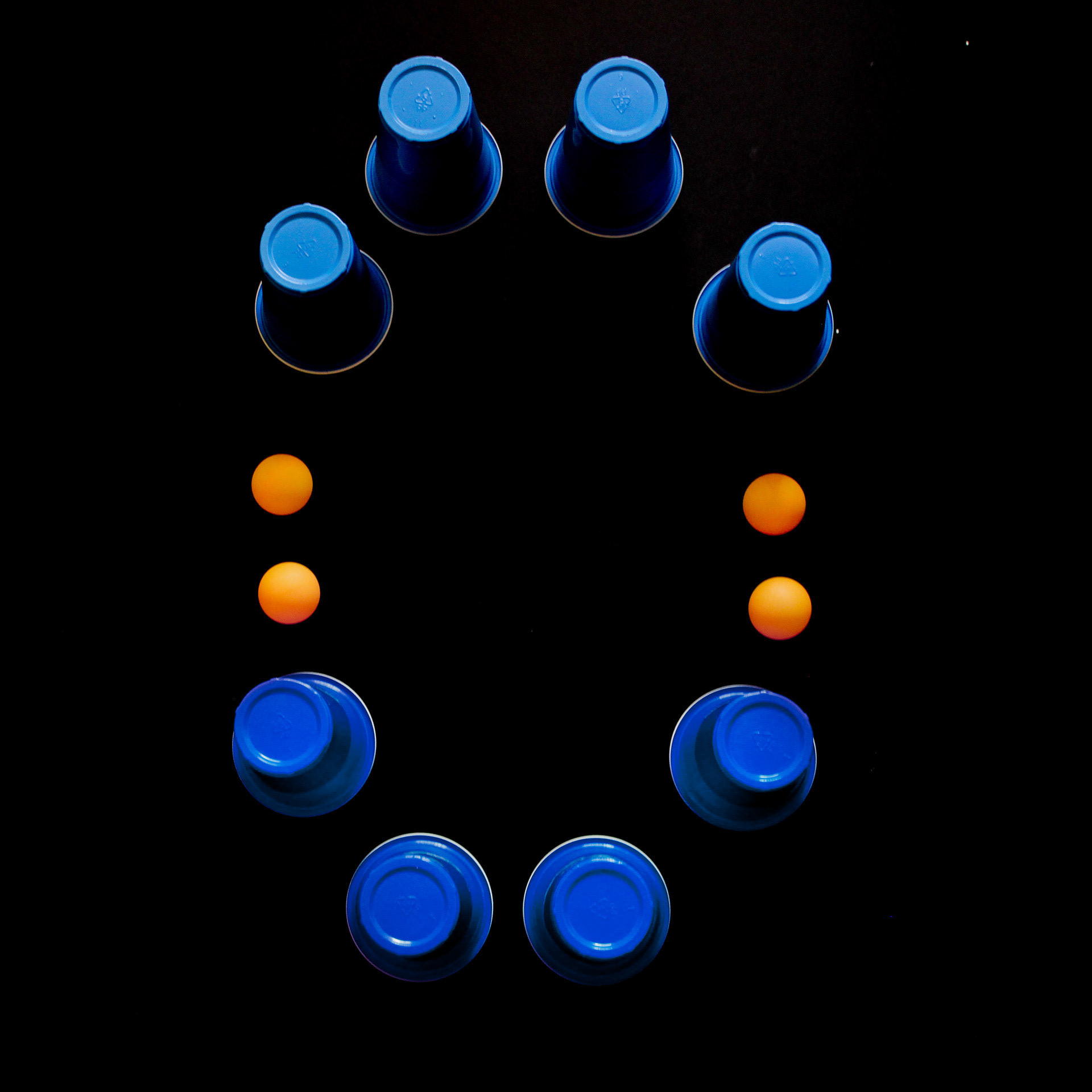
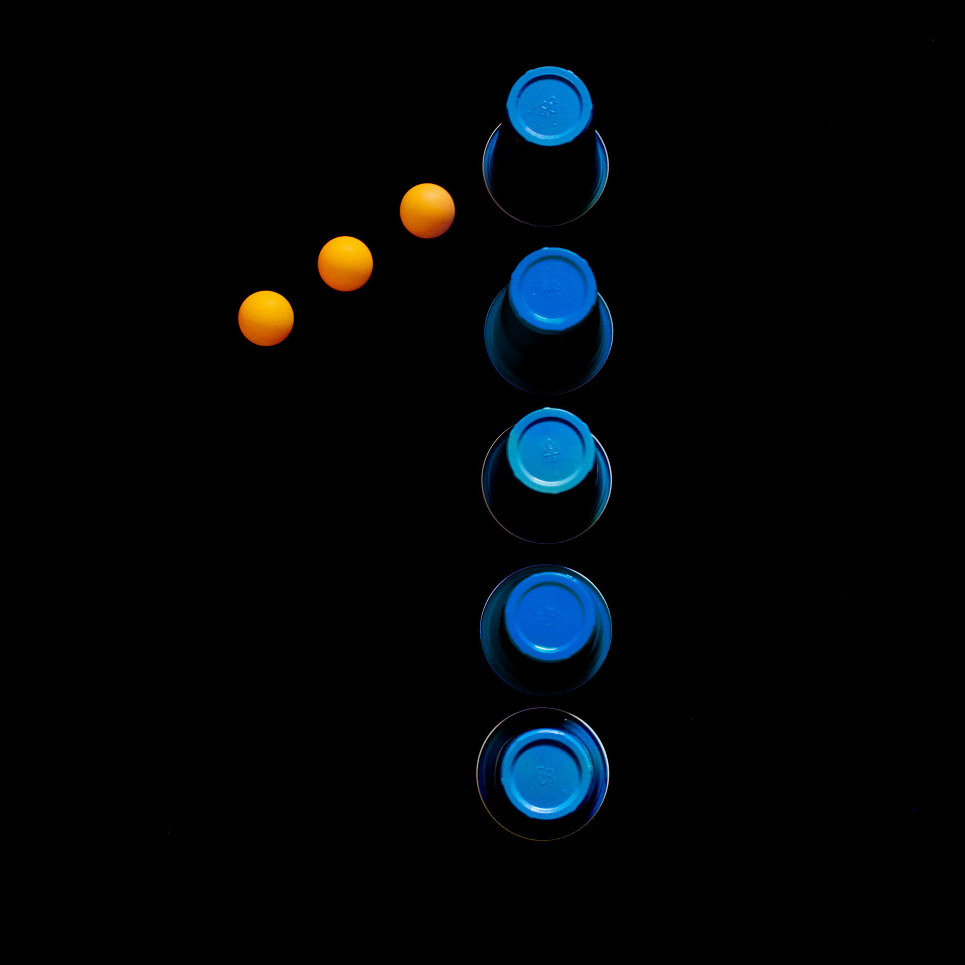
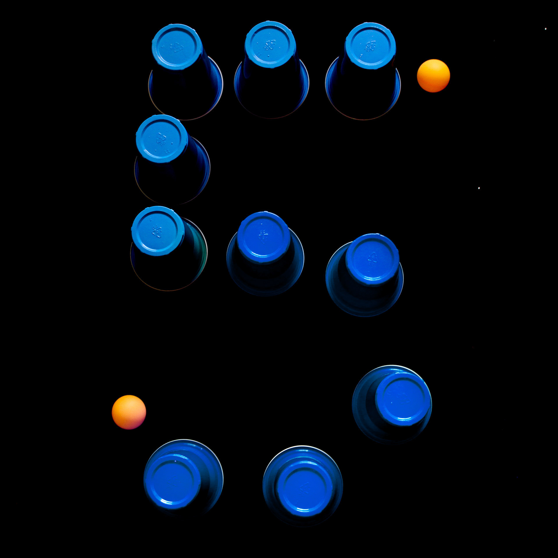
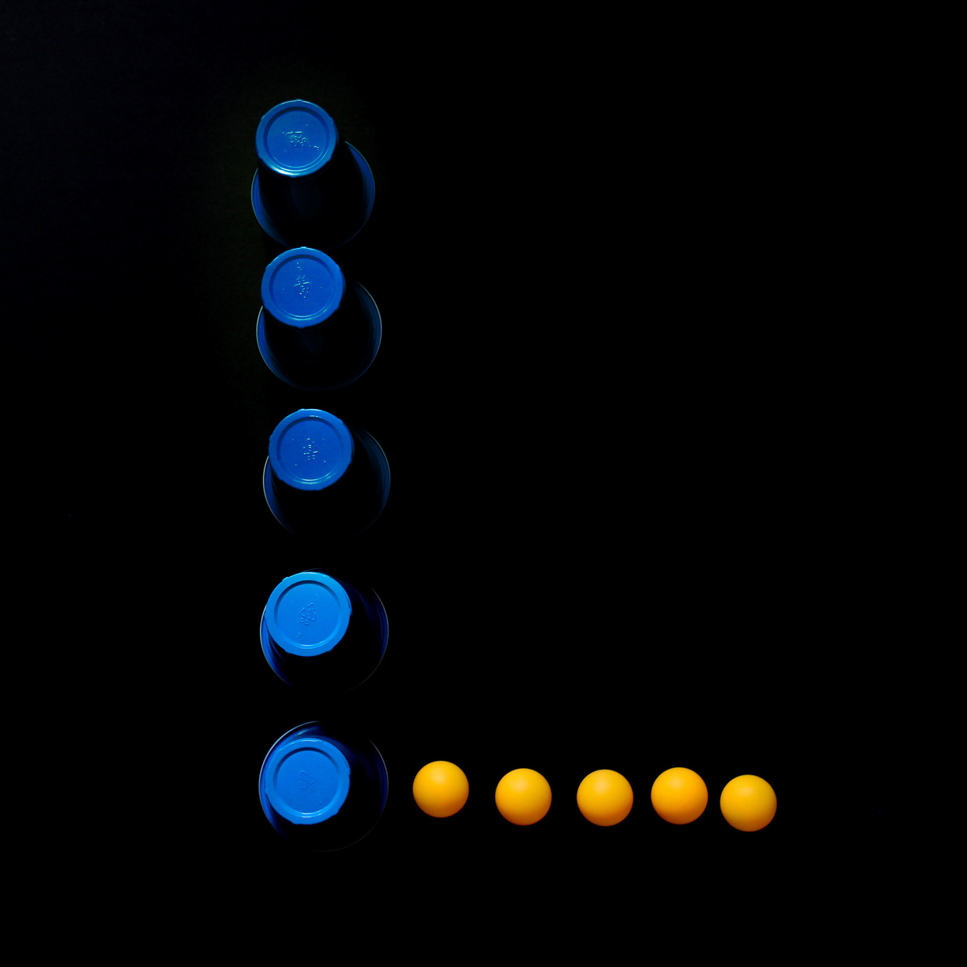
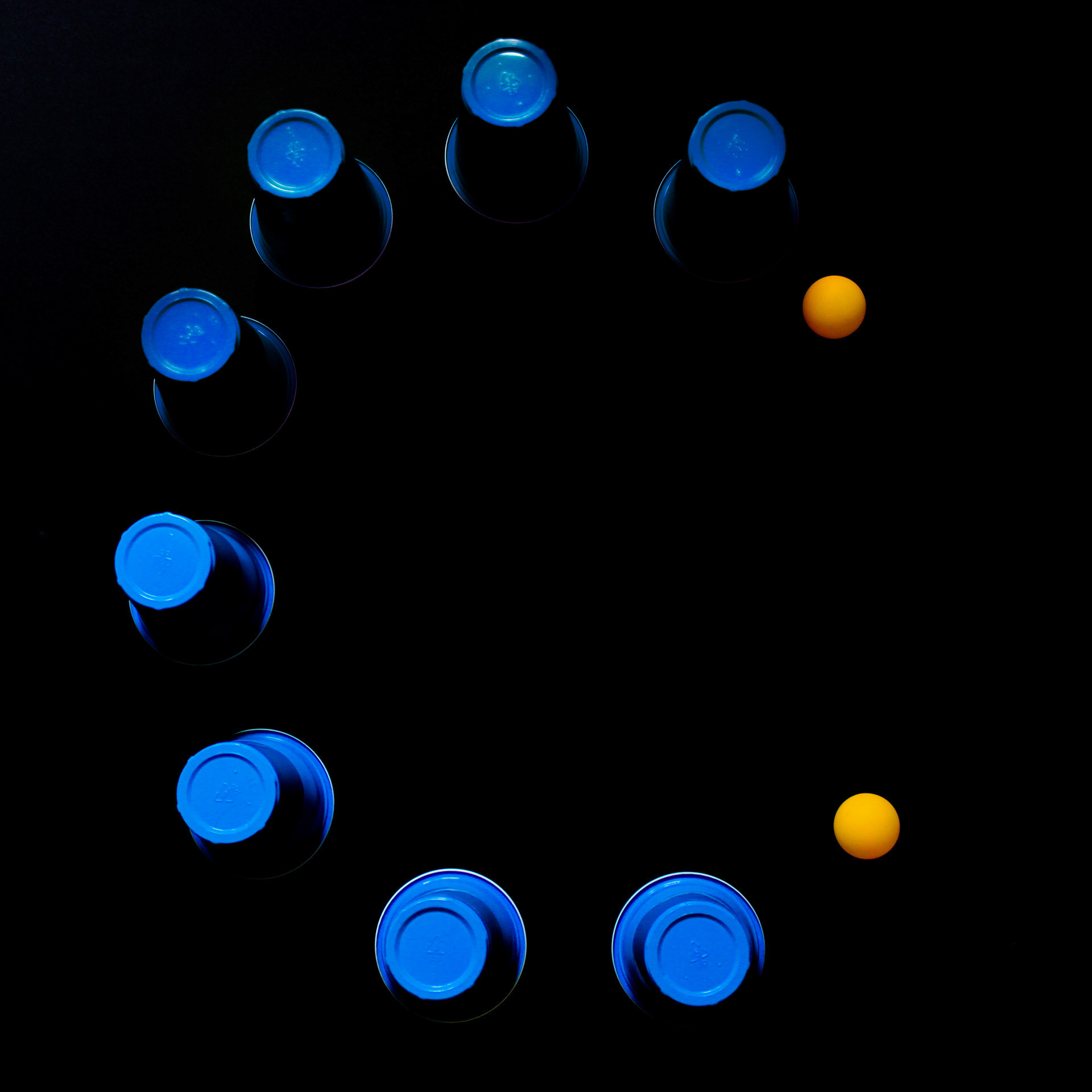
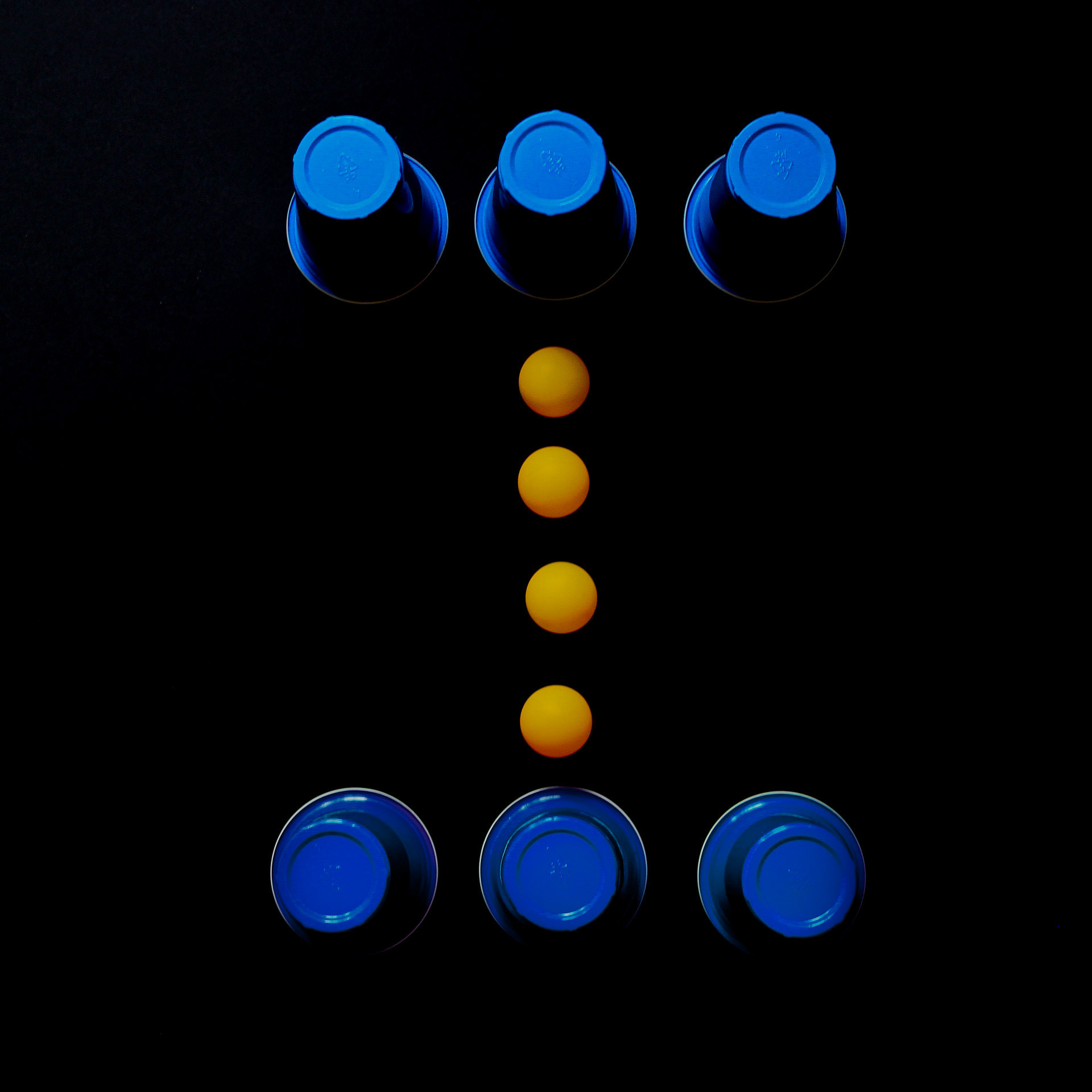
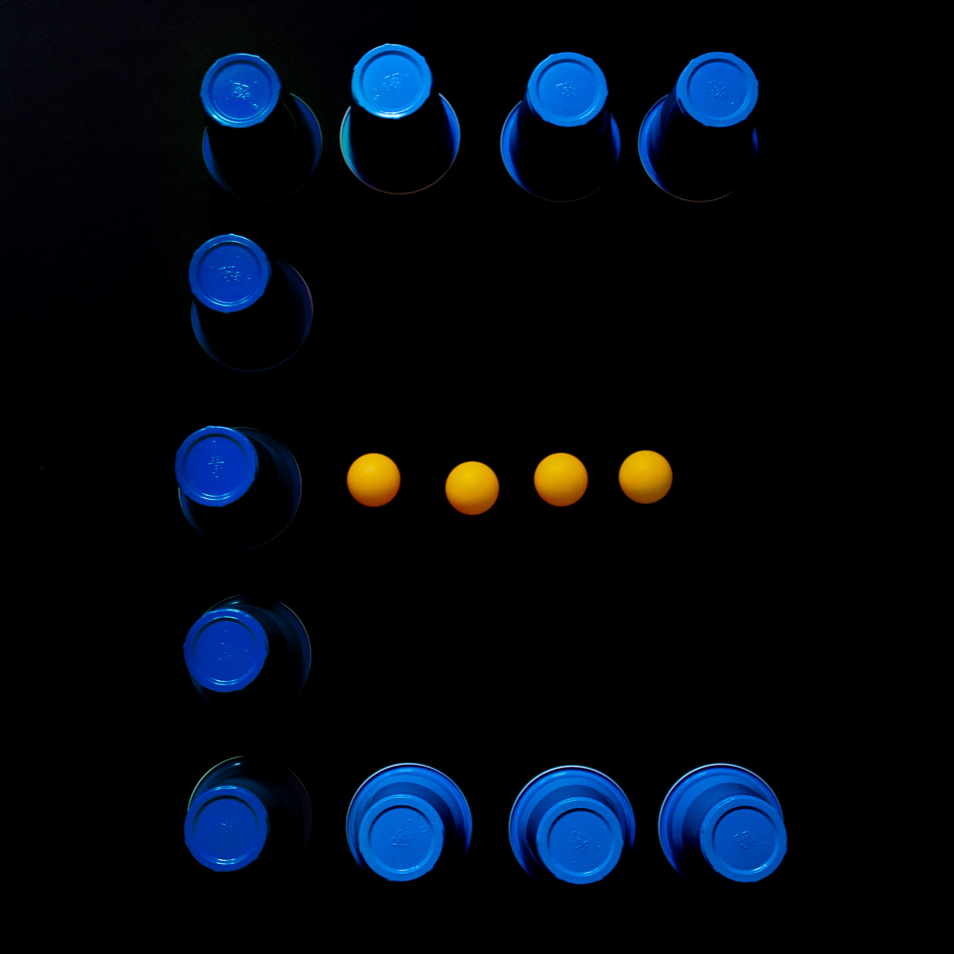
Each letter's photograph underwent meticulous editing. Once perfected, I arranged them on a workspace, culminating in the formation of a complete phrase, bringing the alphabet to life.


THIS PROJECT WAS MADE INDIVIDUALLY FOR A "VISUAL COMMUNICATION II" MARISELA AVALOS IN ESCUELA COMUNICACIÓN MÓNICA HERRERA IN 2022

